ELEANOR AND WILSON GREATBATCH PAVILION BUFFALO, NEW YORK, USA
|
|
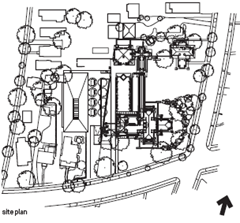
It’s fitting that Darwin D. Martin House should be symbolic of the renewal of modern architecture in Buffalo and in particular, the legacy of Frank Lloyd Wright in the city. Martin, secretary for the Larkin Soap Company, was one of Wright’s great patrons. The demolition of Larkin’s headquarters, which Wright designed in 1904, stands as a notorious example of a US city’s indifference to its architectural heritage and the same fate nearly befell the Martin House. After Martin’s death, it suffered neglect and portions were destroyed and replaced by unsightly 1960s condominium blocks.
The University at Buffalo acquired the building in 1967 and the Martin House Restoration Corporation (MHRC) was set up in 1992. After renovation, in 2002 the MHRC invited five emerging firms to compete for the design of a pavilion that would open up Wright’s complex to the public and provide a much needed centre to reintroduce visitors to the city’s modern architecture. The winner was Toshiko Mori, a Japanese-American architect and former chair of architecture at the Harvard University Graduate School of Design, known for her concern with material innovation and conceptual clarity.
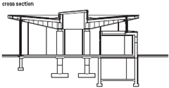
As private house became public institution, Mori based her design on inversion. Wright’s overhanging roofs became an upturned canopy, signalling openness, while overlapping enclosures in plan became a visually extensive yet firmly defined rectangle of space. ‘It’s like a chess game,’ says Mori. ‘If Wright moves in brick, I use transparent glass; if he makes a hipped roof, I use an inverted roof.’
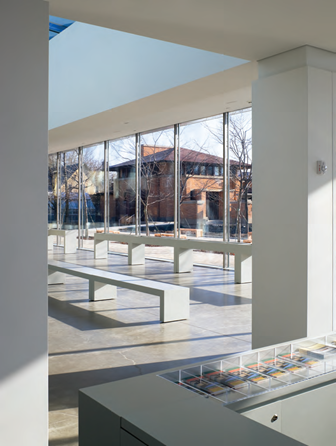
The result seems simple: four central piers, a roof and glass walls. Simplicity, however, requires technical innovation. What appears to be a cantilevered roof is in fact supported by a ring of solid, CNC-milled steel columns at the building’s perimeter, whose slender dimensions (only 70mm square) merge visually with the glass curtain wall to frame a panoramic view of the Martin House.
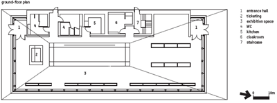
The pavilion minimises its visual presence and strengthens the experience of the house. ‘It’s an idea of anti-building,’ says Mori, ‘as opposed to the very powerful building of Wright.’ This minimal design achieves a surprising degree of spatial complexity. The asymmetrical position of central piers creates a subtle weighting of distinct zones within the plan and a natural sequence between them. A compact entry space with ticket counter connects to a long, narrow area framed by a glass wall, which looks onto the Martin House. This in turn leads into a broader space containing display cases and interactive screens, both designed by the New York graphic design firm 2x4.
The role of information design in the experience of the pavilion is significant. Mori’s competition entry had a lower level containing auditorium and display areas underneath the lawn between the pavilion and house. The central pier was to house a staircase down to this level, framed by a double-height glass wall and a skylight above. As built, the pavilion is a single floor only. The central glass wall is used to project a film on to the Martin House, into the same space from which visitors look out over the complex.
This double-functioning allowed the square footage of the pavilion to be cut in half. It also strengthens its relationship to Martin House. Rather than simply containing information spaces, the pavilion frames a view enriched by information. The experience marks the culmination of a process more than 40 years in the making that gives new meaning to Wright’s masterwork and extends Buffalo’s tradition of architectural innovation into the present.
Mori’s language of steel and glass is
a consciously lightweight foil to Wright’s more
rooted architecture of brick walls and hipped roofs
The Martin House framed by the pavilion
The inverted roof oversails the
delicate walls of full-height glazing


Currently have 0 comments: