ELEANOR AND WILSON GREATBATCH PAVILION BUFFALO, NEW YORK, USA
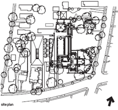
It’s fitting that Darwin D. Martin House should be symbolic of the renewal of modern architecture in Buffalo and in particular, the legacy of Frank Lloyd Wright in the city. Martin, secretary for the Larkin Soap Company, was one of Wright’s great patrons. The demolition of Larkin’s headquarters, which Wright designed in 1904, stands as a notorious example of a US city’s indifference to its architectural heritage and the same fate nearly befell the Martin House. After Martin’s death, it suffered neglect and portions were destroyed and replaced by unsightly 1960s condominium blocks.
The University at Buffalo acquired the building in 1967 and the Martin House Restoration Corporation (MHRC) was set up in 1992. After renovation, in 2002 the MHRC invited five emerging firms to compete for the design of a pavilion that would open up Wright’s complex to the public and provide a much needed centre to reintroduce visitors to the city’s modern architecture. The winner was Toshiko Mori, a Japanese-American architect and former chair of architecture at the Harvard University Graduate School of Design, known for her concern with material innovation and conceptual clarity.
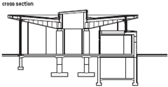
As private house became public institution, Mori based her design on inversion. Wright’s overhanging roofs became an upturned canopy, signalling openness, while overlapping enclosures in plan became a visually extensive yet firmly defined rectangle of space. ‘It’s like a chess game,’ says Mori. ‘If Wright moves in brick, I use transparent glass; if he makes a hipped roof, I use an inverted roof.’
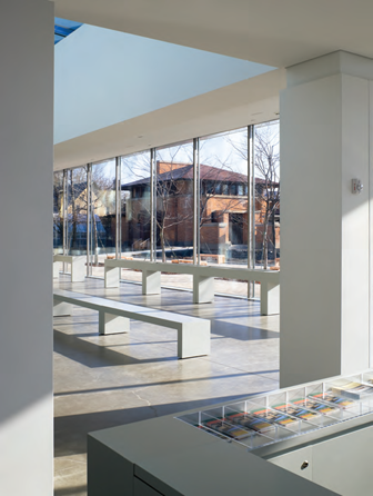
The result seems simple: four central piers, a roof and glass walls. Simplicity, however, requires technical innovation. What appears to be a cantilevered roof is in fact supported by a ring of solid, CNC-milled steel columns at the building’s perimeter, whose slender dimensions (only 70mm square) merge visually with the glass curtain wall to frame a panoramic view of the Martin House.
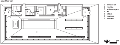
The pavilion minimises its visual presence and strengthens the experience of the house. ‘It’s an idea of anti-building,’ says Mori, ‘as opposed to the very powerful building of Wright.’ This minimal design achieves a surprising degree of spatial complexity. The asymmetrical position of central piers creates a subtle weighting of distinct zones within the plan and a natural sequence between them. A compact entry space with ticket counter connects to a long, narrow area framed by a glass wall, which looks onto the Martin House. This in turn leads into a broader space containing display cases and interactive screens, both designed by the New York graphic design firm 2x4.
The role of information design in the experience of the pavilion is significant. Mori’s competition entry had a lower level containing auditorium and display areas underneath the lawn between the pavilion and house. The central pier was to house a staircase down to this level, framed by a double-height glass wall and a skylight above. As built, the pavilion is a single floor only. The central glass wall is used to project a film on to the Martin House, into the same space from which visitors look out over the complex.
This double-functioning allowed the square footage of the pavilion to be cut in half. It also strengthens its relationship to Martin House. Rather than simply containing information spaces, the pavilion frames a view enriched by information. The experience marks the culmination of a process more than 40 years in the making that gives new meaning to Wright’s masterwork and extends Buffalo’s tradition of architectural innovation into the present.
Mori’s language of steel and glass is
a consciously lightweight foil to Wright’s more
rooted architecture of brick walls and hipped roofs
The Martin House framed by the pavilion
The inverted roof oversails the
delicate walls of full-height glazing
The concept is Fascinating But The Shows Were A Bit Dull
Canary Islanders are dead sick of tourists. Local government, the PR team, even the biennial director and curator, architect Juan Manuel Palerm Salazar, have said that the Second Biennial of the Canary Islands is about hosting a cultural event for local people. Exhibitions and events are entirely in Spanish, with mostly Spanish, Italian or Portuguese exhibitors, and this year’s theme, ‘Silencio’ (silence), is a call to study the local landscape.
Silencio refers to the exploitation of the Canary Islands’ natural landscape, first as a means of production (mainly bananas), then as a product sold to tourists. The 1970s tourism boom resulted in a raft of badly constructed and ugly hotels littering the coastline, with subsequent developments climbing cliffs and expanding the beaches.
These eyesore developments are such a hot issue that the government currently has a bill in Parliament to freeze all new tourism developments on new land. Old hotels can be refurbished or replaced, but the natural landscape must be preserved – the president of the Canary Islands has said – because the island’s unique The concept is fascinating but the shows were a bit dull tourist economy depends on it.
If the concept is fascinating – the biennial as a multi-disciplinary, intensive study of the islands’ 30-year-old tango with tourism – most of the exhibitions were, frankly, a bit dull. The most interesting work, exhibited in Las Palmas on the island of Gran Canaria, was completed by the biennial’s internal research team, which used detailed maps, documentary photographs and statistics to study the pace and spread of development.
The photography exhibition at CAAM modern art gallery in Las Palmas was another bright spot – a collection of work that documented cities in transition, including Francesco Jodice’s photo series What We Want, which charters how changing cities reveal our desires.
The architectural projects exhibited at CAAM, however, (and this goes for several of the other venues as well) consisted of projects that were several years old, previously published and only tenuously linked to the biennial theme. Most exhibits had their plans crowded, with small type, on to large illuminated boards. Models, drawings or concept sketches were practically non-existent.
In the end, a visit to this fledgling biennial is an excuse, not a reason, to visit the Canary Islands. The ‘keep it local’ biennial concept has potential. If repeated, it could result in some fascinating site-specific work. But, while I did learn a lot about the pressing issues facing the islands – from the boat people that arrive daily from Africa, to internal tensions stemming from tourism and increased multiculturalism – much of this was gleaned from articles in the biennial programme guide. Hopefully the biennial catalogue, to be published later this year, will save punters a disappointing trip by reporting and expanding on the best of the work on show.

The Relationship of Structure to Building
The simplest way of describing the function of an architectural structure is to say that it is the part of a building which resists the loads that are imposed on it. A building may be regarded as simply an envelope which encloses and subdivides space in order to create a protected environment. The surfaces which form the envelope, that is the walls, the floors and the roof of the building, are subjected to various types of loading: external surfaces are exposed to the climatic loads of snow, wind and rain;floors are subjected to the gravitational loads of the occupants and their effects; and most of the surfaces also have to carry their own weight (Fig. 1). All of these loads tend to distort the building envelope and to cause it to collapse; it is to prevent this from happening that a structure is provided. The function of a structure may be summed up, therefore, as being to supply the strength and rigidity which are required to prevent a building from collapsing. More precisely, it is the part of a building which conducts the loads which are imposed on it from the points where they arise to the ground underneath the building, where they can ultimately be resisted.

The location of the structure within a building is not always obvious because the structure can be integrated with the non-structural parts in various ways. Sometimes, a sin the simple example of an igloo (Fig. 2), in which ice blocks form a self-supporting protective dome, the structure and the space enclosing elements are one and the same thing. Sometimes the structural and space-enclosing elements are entirely separate. Avery simple example is the tepee (Fig. 3), in which the protecting envelope is a skin of fabric or hide which has insufficient rigidity to form an enclosure by itself and which is supported on a framework of timber poles.Complete separation of structure and envelope occurs here: the envelope is entirely non-structural and the poles have a purely structural function.


on a structural framework of timber poles.
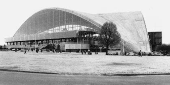
The CNIT exhibition Hall in Paris (Fig. 4) is a sophisticated version of the igloo; the reinforced concrete shell which forms the main element of this enclosure is self-supporting and, therefore, structural. Separation of skin and structure occurs in the transparent walls,however, where the glass envelope is supported on a structure of mullions. The chapel by Le Corbusier at Ronchamp is a similar example. The highly sculptured walls and roof of this building are made from a combination of masonry and reinforced concrete and are self-supporting.They are at the same time the elements which define the enclosure and the structural elements which give it the ability to maintain its form and resist load. The very large ice hockey arena at Yale by Saarinen is yet another similar example. Here the building envelope consists of a network of steel cables which are suspended between three reinforced concrete arches, one in the vertical plane forming the spine of the building and two side arches almost in the horizontal plane. The composition of this building is more complex than in the previous cases because the suspended envelope can be broken down into the cable network, which has a purely structural function, and a non-structural cladding system. It might also be argued that the arches have a purely structural function and do not contribute directly to the enclosure of space.
Fig. 4. Exhibition Hall of the CNIT, Paris, France; Nicolas Esquillan, architect. The principal element is a self supporting reinforced concrete shell
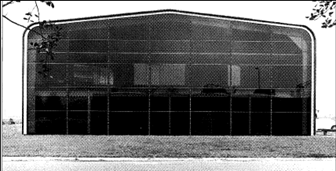
Fig. 5. Modern art glass warehouse, Thamesmead, UK, 1973; Foster Associates, architects; Anthony Hunt Associates,
structural engineers. A non-structural skin of profiled metal sheeting is supported on a steel framework, which has a purely structural function.
The steel-frame warehouse by Foster Associates at Thames mead, UK (Fig. 5), is almost a direct equivalent of the tepee. The elements which form it are either purely structural or entirely non-structural because the corrugated sheet metal skin is entirely supported by the steel frame, which has a purely structural function. A similar breakdown may be seen in later buildings by the same architects, such as the Sainsbury Centre for the Visual Arts at Norwich and the warehouse and showroom for the Renault car company at Swindon.
In most buildings the relationship between the envelope and the structure is more complicated than in the above examples, and frequently this is because the interior of the building is subdivided to a greater extent by internal walls and floors. For instance, in Foster Associates’ building for Willis, Faber and Dumas, Ipswich, UK (Fig 6), the reinforced concrete structure of floor slabs and columns may be thought of as having a dual function. The columns are purely structural, although they do punctuate the interior spaces and are space-dividing elements, to some extent. The floors are both structural and space-dividing elements. Here,however, the situation is complicated by the fact that the structural floor slabs are topped by non-structural floor finishing materials and have ceilings suspended underneath them. The floor finishes and ceilings could be regarded as the true space-defining elements and the slab itself as having a purely structural function.The glass walls of the building are entirely non-structural and have a space-enclosing function only. The more recent Carré d’Art building in Nîmes (Fig. 7), also by Foster Associates, has a similar disposition of parts.As at Willis, Faber and Dumas a multi-storey reinforced concrete structure supports an external non-load bearing skin.


The Antigone building at Montpellier by Ricardo Bofill (Fig. 8) is also supported by a multi-storey reinforced concrete framework.The facade here consists of a mixture of in situ and pre-cast concrete elements, and this, like the glass walls of the Willis, Faber and Dumas building, relies on a structural framework of columns and floor slabs for support. Although this building appears to be much more solid than those with fully glazed external walls it was constructed in a similar way. The Ulm Exhibition and Assembly Building by Richard Meier (Fig. 9) is also supported by a reinforced concrete structure. Here the structural continuity and mouldability which concrete offers were exploited to create a complex juxtaposition of solid and void. The building is of the same basic type as those by Foster and Bofill however; a structural framework of reinforced concrete supports cladding elements which are non-structural.
Fig. 8. Antigone, Montpellier, France, 1983; Ricardo
Bofill, architect. This building is supported by a reinforced
concrete framework. The exterior walls are a combination
of in situ and pre-cast concrete. They carry their own weight
but rely on the interior framework for lateral support.
Fig. 9. Ulm Exhibition and Assembly Building,
Germany, 1986–93: Richard Meier & Partners, architects.
The mouldability of concrete and the structural continuity
which is a feature of this material are exploited here to
produce a complex juxtaposition of solid and void.
(Photo: E. & F. McLachlan)
In the Centre Pompidou in Paris by Piano and Rogers, a multi-storey steel framework is used to support reinforced concrete floors and non-load bearing glass walls. The breakdown of arts is straightforward (Fig. 10): identical plane-frames, consisting of long steel columns which rise through the entire height of the building supporting triangulated girders a teach floor level, are placed parallel to each other to form a rectangular plan. The concrete floors span between the triangulated girders.Additional small cast-steel girders project beyond the line of columns and are used to support stairs, escalators and servicing components positioned along the sides of the building outside the glass wall, which is attached to the frame near the columns. A system of cross-bracing on the sides of the framework prevents it from collapsing through instability.

Rogers, architects; Ove Arup & Partners, structural
engineers. The separation of structural and enclosing
functions into distinct elements is obvious here
The controlled disorder of the rooftop office extension in Vienna by Coop Himmelblau (Fig. 11) is in some respects a complete contrast to the controlled order of the Centre Pompidou. Architecturally it is quite different,expressing chaos rather than order, but structurally it is similar as the light external envelope is supported on a skeletal metal framework.
Fig. 11 Rooftop office in Vienna, Austria, 1988; Coop
Himmelblau, architects. The forms chosen here have no
structural logic and were determined with almost no
consideration for technical requirements. This approach
design is quite feasible in the present day so long as the
building is not too large
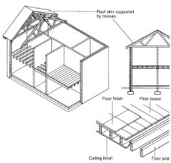
The house with masonry walls and timber floor and roof structures is a traditional form of building in most parts of the world. It is found in many forms, from the historic grand houses of the European landed aristocracy (Fig. 12) to modern homes in the UK (Figs 13 and 14).Even the simplest versions of this form of masonry and timber building (Fig. 13) are fairly complex assemblies of elements. Initial consideration could result in a straight forward breakdown of parts with the masonry walls and timber floors being regarded as having both structural and space-dividing functions and the roof as consisting of a combination of the purely supportive trusses, which are the structural elements, and the purely protective, non-structural skin. Closer examination would reveal that most of the major elements can in fact be subdivided into parts which are either purely structural or entirely non-structural. The floors,for example, normally consist of an inner core of timber joists and floor boarding, which are the structural elements, enclosed by ceiling and floor finishes. The latter are the non-structural elements which are seen to divide the space. A similar breakdown is possible for the walls and in fact very little of what is visible in the traditional house is structural, as most of the structural elements are covered by non-structural finishes.
Fig. 12. Château de Chambord, France, 1519–47. One of the grandest domestic buildings in Europe, the Château de Chambord has a load bearing masonry structure. Most of the walls are structural; the floors are either of timber or vaulted
masonry and the roof structure is of timber
Fig. 13. Traditional construction in the
UK, in its twentieth-century form, with
load bearing masonry walls and timber
floor and roof structures. All structural
elements are enclosed in non-structural
finishing materials
To sum up, these few examples of very different building types demonstrate that all buildings contain a structure, the function of which is to support the building envelope by conducting the forces which are applied to it from the points where they arise in the building to the ground below it where they are ultimately resisted. Sometimes the structure is indistinguishable from the enclosing and space-dividing building envelope, sometimes it is entirely separate from it; most often there is a mixture of elements with structural, non-structural and combined functions. In all cases the form of the structure is very closely related to that of the building taken as a whole and the elegance with which the structure fulfils its function is something which affects the quality of the architecture.
Fig. 14. Local authority housing, Haddington, Scotland,
1974; J. A. W. Grant, architects. These buildings have
load bearing masonry walls and timber floor and roof
structures
Working with Aluminum Part 2
Before these limitations are reached, however, cost and availability may be overriding considerations. A number of techniques can be employed to minimize extrusion cost:
1) Minimize the size of the smallest circle that encloses the section. Sometimes this can be done by extruding a folded version of the section desired and then unfolding it after extruding by rolling or bending.
2) Avoid hollows where possible. They require more complex dies and are more difficult to extrude.
3) Avoid large differences in wall thickness in different parts of the cross section. For 6063, the largest ratio of maximum to minimum wall thickness should be 3:1; for 6061-T6, use 2:1.
4) Keep the perimeter-to-cross-sectional area ratio as low as possible. Some extruders estimate costs based on this ratio.
5) Avoid sharp corners, using generous fillets or rounding where possible.
6) Ask extruders which changes to a proposed section would reduce cost.
Extruded structural shapes can perform additional functions by incorporating some of these features :
1) Interlocking Sections: Extrusions can be designed to interlock with other extrusions to facilitate connections. Several kinds of extrusion interlocks exist. Some are designed to act like hinges (Figure 5a), with one piece being slid into the other from one end. Other extrusions are designed with nested interlocks that align parts, which are then fastened together (Figure 5b). Still others are designed as friction fit or snap-lock interlocks, which require the parts to deform elastically to fit together (Figure 5c). Unlike the first two joints, the friction fit joint cannot be disassembled without destroying the parts. None of these interlocks are considered to transmit enough longitudinal shear to enable the parts to act as a unit structurally without other means of fastening (133). To prevent longitudinal slippage at significant loads requires a fit too tight to make with parts extruded to standard tolerances.

2) Skid-Resistant Surfaces: Although the extrusion process is only capable of producing longitudinal features in a cross section, skid-resistant surfaces are routinely made with extrusions. This is achieved by extruding small triangular ribs on the surface (Figure 6), and then notching the ribs in the transverse direction after extruding. Extruders may perform the notching economically by running a ribbed roller over the ridges.
3) Indexing Marks: Shallow grooves extruded in parts can indicate where a line of holes is to be punched or drilled. These marks (raised or grooved) can also be used to identify the extruder, distinguish an inside from an outside surface, or distinguish parts otherwise similar in appearance. Dimensions for a typical indexing mark are shown in Figure 7.
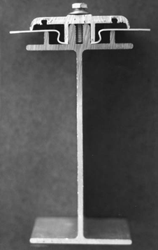
4) Screw Chases: A ribbed slot (also called a screw chase or boss) can be extruded to receive a screw. This may be used, for example, to attach a batten bar to a frame member (Figure 8). A method for calculating the amount of lateral frictional resistance to sliding of a screw in a chase is given in AAMA TIR-A9-1991 (34). This calculation must be performed if the design considers both of the connected parts to act as a continuous section. The dimensions of the screw chase are a function of screw dimensions and strength. If the screw chase is too narrow, the head of the screw may break off before the
screw is fully driven. If the chase is too wide, the ribs of the chase may strip during fastener installation. The maximum screw torque before stripping is fairly sensitive to the chase width. The narrow dimension of the chase should be less than the root diameter of the screw. The dimensions used successfully for a screw chase for a -20 UNC screw are shown in Figure 9.

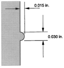
Figure 8. Use of a screw chase to connect extruded parts. (Courtesy of Conservatek
Industries, Inc.)
5) Gasket Retaining Grooves or Guides: In curtain wall, fenestration, and other applications, elastomeric gaskets are often required between parts. By extruding a groove in the metal that matches a protrusion on a gasket, you can eliminate the need for field assembly or adhesives. Usually the gasket is press-fit into the extrusion in the shop. Dimensions for such a detail are shown in Figure 10. Care must be taken to avoid stretching the gasket during installation to prevent contraction of the gasket in the field to a length shorter than required.
6) Extrusions as a Substitute for Plate: Plate costs about 1 times the cost 1–2 of extrusions, so it’s desirable to utilize extrusions rather than plate wherever possible. Extruding to final width dimensions also eliminates the need to cut plate to the desired width, thereby saving fabrication costs. Extruded bars are available from a number of extruders through about 18 in. [457 mm] widths or more, depending on thickness.
7) Non-prismatic Extrusions: Extrusions may have different cross sections along their length when stepped extrusion methods are used. The smallest section is extruded first, the die is changed, and a larger section that contains the full area of the smaller section is extruded next. This method is used on aircraft wings to minimize the amount of machining needed to produce tapered members. Other tapered members, such as light poles, may be produced by spinning. Set-up costs for these methods are high, so they tend to be used only on parts that will be produced in quantity.

Figure 10. Dimensions to allow a gasket to be press fit into an extruded slot
8) Grooves for Fasteners: Grooves can be extruded to permit screw heads to be flush with the surface of an extrusion to avoid the need for countersinking the fastener hole. Groove widths sized to a bolt head flat width can also be used to prevent rotation of the bolt during tightening of the nut. Another use for grooves is to reduce the loss of cross-sectional area that occurs at holes (Figure 11).
9) Integral Backing for Welds: As shown in Figure 12, built-in backing for longitudinal welds along an extrusion edge can be provided, eliminating the need for separate backing and the need to hold it in place during welding.
Hollow Extruded Shapes If you’re like most people, you may need a moment of head scratching to imagine how hollow extruded shapes are possible. Extruders use three methods :
Figure 11. Use of an extruded groove in a line of bolts to secure the bolt heads
from spinning, and to reduce the loss of effective net area in the cross section
Figure 12 Extruded integral backing for a weld. (Courtesy of the Aluminum
Association)
1) Solid Billet and a Porthole Die: In this method, the metal is divided into two or more streams by the supports for the mandrel that forms the hollow portion of the shape. The metal must reunite (sometimes referred to as ‘‘welding’’) behind the supports before it flows through the die, outlining the perimeter of the shape.
2) Solid Billet and a Piercer Operating Through a Hollow Ram: This method avoids the seams inherent in the porthole die approach and, thus, produces a seamless extrusion.
3) Hollow Billet with a Die and Mandrel: This method also produces a seamless extrusion, but it is rarely used.
The material specification identifies if hollow extrusions must be seamless (for example, ASTM B241 Aluminum and Aluminum-Alloy Seamless Pipe and Seamless Extruded Tube) (53). Do seamless hollow shapes have better structural properties than shapes with seams? The answer is no, not with respect to material properties; the minimum strengths for porthole die produced hollow extrusions are the same (all other things being equal) as those for seamless extrusions. For properly extruded shapes, seams do not appear to have any adverse effect on structural performance, such as burst pressure or fatigue.


