Town & Country
|
|
Although moving from a spacious country lot to a smaller city home can be challenging, seasoned interior designer Jan Speziale proves that the testament to good design is in the details.
“I’m a Type A trying really hard to be a type B". says Jan Speziale, one half of the design duo behind award-winning Barnard & Speziale Design Associates Inc. in Waterdown, Ontario. "It's the Virgo in me," explains the interior design veteran of 35 years, "I'm very particular". Whether or not you follow the celestial skies, when she decided to downsize from a one-acre country property to a 1,850 square-foot Burlington home, the house that Jan built is proof that good design is in the details - from the polished nickel knobs, right down to the travertine and walnut floors.
Just don't describe the cathedral ceiling in her great room as white. °I never, ever do pure white. I find it too cool. I prefer a softer off-white that has a creamy undertone to it". Likewise, to "ground" the mainly sandstone palette in her walls, drapery and upholster}', she selected charcoal - not black - for the upper triangles that support the arch. A zebra skin rug and vintage painting ties the look together.
Besides the aesthetic minutiae, Speziale also had her hand in the larger structural aspects of the construction and design. One of the main changes affected the original L-shaped kitchen and breakfast nook. While a second eating area ranked low on Speziale's wish list, she really wanted space so she could elongate her dining table and accommodate ten people. "My family is big and my siblings and I are all foodies".
So, in order to make wav for her coveted saber-leg walnut centre piece table, which stretches to 109 inches, Speziale deleted the dinette space, added stools to the food prep island, and reconfigured the adjoined space to showcase a double-lane galley kitchen. "'There's usually up to four people in there whenever we all get together". She also added a backdrop of alternating-height, custom cherry wood cabinets to create "interest".
With no line of vision overlooked, a liquor cabinet was designed to hide the sink: "I didn't want to see the faucet when I was sitting in the great room". Thus, connected to the generous granite countertop, a "little bar" cuts into the horizontal plane, infusing a dose of visual tension. "Whenever I entertain, that's usually where people gather," she laughs.
A second structural change allowed for more natural light. With only four feet between each house, windows were conspicuously absent on the east and west walls. Consequently, the three lookouts on the blueprint's north face were traded for more expansive sliding doors, which lead to the back patio.
More walls were shifted in the den. In lieu of the existing guest bedroom with closet and full I7ath, a two-piece powder room entered the main floor scene, leaving more square footage for a study in the sunny wing, now papered in striking red grass cloth. The resident leather couch, one of the few pieces that made the transition from country to urban, is a matching poppy hue. Mention the colour red and people kind of get freaked out, says Speziale, hut the interesting thing is, the more you use a colour, the less dominant it becomes. "I had a red room in my old house and I loved it. It's energizing and I find it very warm and inviting".
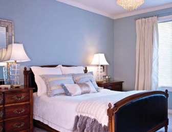
"The master bedroom and en suite bath, however, sit at the other end of thee colour spectrum in "Gray Wisp," a soft grey/blue tone by Benjamin Moore. "I wanted it to be verb= calm and serene". Fit for a Virgo Queen, the room boasts a reproduction antique head- and footboard and crystal chandelier with contemporary drum shade. For that added bit of personality, Speziale accessorized her Louis-inspired French chest - stacked by Venetian style mirror - with two cut crystal lamps. "[ love the way it sparkles".
The third major structural change was realized in the loft; a mini-guest studio complete with bath. "Visitors love i t because it's like a private getaway up there," explains Speziale. "On plan, it was just one big open space.l wanted to create as much storage as possible and that was a great place to do it". Speziale created an alcove around the bed by pulling the feature wall forward and creating two 24-inch deep wardrobes on either side. "One can never have too much closet space," she says.
The garden/extended living room posed similar storage challenges. Short of dragging all the outdoor furniture to the front of the house and into the garage for the winter, a place was needed to store it. And so, rather than having an open pergola, Speziale built a structure with cedar shake roof and skylight. A back wall, she notes, also camouflages her neighbour's eyesore shed.
Although the shops and restaurants along the waterfront are within walking distance, Speziale admits it took her some time to get used to living so close to others. "I think people are always surprised when they come here because they don't expect to see something so private that's downtown". But it was vital for her to create this little outdoor oasis. "I love the sound of the wind and the trees". The Virgoan surmises, "1'm an earth sign; so I guess that's why".


Currently have 0 comments: