IL Forte Di Fortezza
Begun under Francis I in the year 1833; completed by Ferdinand I in the year 1838’ reads the Latin inscription over the gate of a monumental fortress that dominates the village of Fortezza (originally called Franzensfeste) in Alpine northern Italy, near the border with Austria. Strategically positioned to oversee the entrance to the Eisack Valley, this brooding redoubt was constructed by the Habsburgs to protect their empire from growing anti-imperialist fervour fomented by the French revolution.
In just five years, 6,000 workers and soldiers constructed the complex under the direction of regimental engineer Franz von Scholl. Resembling a small town, it consists of three separate fortified enclaves hugging the contours of the hillside site. Executed in a functional yet heroic stripped classical language, it was built to last, an impregnable bastion of imperial power.
Despite the Habsburgs’ impressive mobilisation of men and resources, the revolutionary threat failed to materialise. The fortress soon became redundant, ‘built for an enemy who never came,’ according to local historian Josef Rohrer. By the end of the 19th century this supreme manifestation of military and imperial hubris was serving as a humble powder depot. In 1918 Franzensfeste came under Italian rule and became Fortezza (though German is still widely spoken in the region) and the complex was used by the Italian army until 2003.
The heroic stripped classicism of the fort informs the new additions
Relinquished by the military and acquired by the province of South Tyrol, it now has a new incarnation as a historic monument and place of cultural exchange. In 2008 it was one of the four venues for Manifesta 7, the European biennale of contemporary art, and in 2009 it hosted the Landesausstellung, a regional arts festival. With its massive walls and labyrinthine underground passages, the fortress provided an apt backdrop to the festival’s theme of freedom, set against the historically defensive culture of the Tyrol.
The fort overlooks a lake. A pair of new walkways rationalize circulation
Local architects Markus Scherer and Walter Dietl were commissioned to restore the structure so it could cope with the new demands of exhibitions and tourism. Preserving the existing buildings while also emphasising the distinctive character of the architecture was key to Scherer and Dietl’s brief. The thick granite walls were restored, roofs waterproofed and windows repaired. Walled-off spaces were opened up and unsympathetic later additions removed. Throughout, the process has been a tactful cleaning up and drilling down to the raw form and structure of the fort, which itself acts as a cue for the new interventions.
From the entrance courtyard behind the main gate, the extent of the complex is not immediately obvious. Minimally articulated stone structures that once housed barracks, stables and stores now accommodate a visitor centre, bar, restaurant, children’s play area and an exhibition space spread over an enfilade of rooms. Carefully restored vaults of exposed brickwork and plastered walls, some embellished with murals, convey a powerful sense of the past. A 22m-deep vertical shaft was driven through the rock to connect the lower fortress with a subterranean cavern. A dark concrete staircase with a golden handrail spirals up through the shaft, terminating in a partially destroyed powder magazine, which was restored and reconfigured as a new circulation pavilion.
New parts have the same tough, stripped-down spirit as the original architecture. Thick concrete blocks are used to form simple buildings and enclosures. Between the blocks, layers of sand were flushed out to produce an irregular horizontal joint pattern and the surface of the concrete was roughened by sandblasting with fine granite particles to match the colour of the existing stone. The weatherbeaten effect mimics the passage of time, so the new interventions have the feel of a modern ruin.
The most dramatic new addition is a double deck arrangement of dog-leg shaped catwalks that swing out precipitously over a lake at the lowest level to connect the exhibition spaces and complete the visitor circuit. Like the new doors, grilles and handrails, the bridges are made of galvanised steel coated with a rough black patina. Thin and sharp like a blade, the dark steel crisply counterpoints the massive stone walls. This intelligently judged reciprocity between architectures, eras and functions is emblematic of the surprising rebirth of an extraordinary piece of 19th-century military history.
The Most Expensive Development in US History Tries to Redefine Junkspace Urbanism on The Strip
Las Vegas is universally dismissed as non-architectural or anti-urban. At night, neon signs and electronic billboards orientate the car driver and conveniently overshadow the city’s junkspace context of car parks. They signal Vegas’ immersive gambling enclave hugging the four-mile Strip yet, while old signs are regularly taken to the neon graveyard
in the Nevada desert, little contemporary architecture has replaced them. The Strip’s relative resurgence at the hands of entrepreneur Steve Wynn reached its height with the 1998 Bellagio hotel and casino, now owned by gambling giant MGM Mirage. With its eight-acre lake and artsy dancing fountains, it was merely another thematic step from Vegas’ mid-century modernism of the Rat Pack era.
Now off the Strip, and attached to Bellagio by a three- stop tramline, is City Center, where starchitecture is a keypart of the development gamble. It took MGM Mirage five years to build and cost a cool $8.5 billion. Replacing the immaterial graphic skyline with a veritable architectural zoo, this compact ‘city within a city’ transforms 27 hectares etched out of land adjoining the Strip on which a third-rate hotel and multi- storey car park once stood.
When Robert Venturi and Denise Scott Brown wrote Learning from Las Vegas in 1972, examining the cultural context of the city as a generator of form, they critiqued mindless Strip development and reinvented the casino as a quasi-public space that spills out and engages the street in an update of the Roman piazza. In a city where context and use has been so out of tune with reality, and what seems to be reality is not, MGM Mirage now claims to have shifted the Vegas paradigm.
The ramped entry street indeed leads you to a piazza in front of Pelli Clarke Pelli’s hefty crystalline Aria Resort. At the hub of one of three blocks on the Gensler-designed masterplan, building and piazza are bonded by a huge curving waterwall. Everything radiates from here and, instead of a spilled-out casino, there is the first of many art installations on the site. The overhead monorail shuttles visitors between ‘historic’ Vegas (neighbours Monte Carlo and Bellagio) and new Vegas (Studio Daniel Libeskind’s shopping centre, Crystals). Negotiating Aria’s labyrinth of foyer casino to find the elevators to the rooms is a bore. Up front, the building lamely accommodates the fleecing space that pays its way, and Aria suffers as a result.
The pharaonic undertaking of CityCenter engaged seven architects, 60 interior designers and over 250 design consultants in total, in a project which took only five years to build from inception in 2005, picking up a LEED Gold certification for sustainability. It is too soon to know whether CityCenter is economically sustainable, but its tactics are a unity of art and architecture, mixed programme (70 per cent non-gaming allocation, for dining, hotels, spas and so on) and the semblance of civic identity across the pedestrian- friendly district. There may be high-end hotels – two with retail apartments – but no housing for the workers of this place of pleasure, or food shops, as occupants eithereat out or order in.
At CityCenter’s gateway is KPF’s Mandarin Oriental, an elegantly simple and tactile building with a facade of interlocking motifs of vertical stainless steel panels and fritted glass. It bears a standard tall atrium, but the upper-floor podium, complete with ballroom and huge window overlooking the Strip, feels genuinely fresh – for Vegas.
With a pocket park lying between Aria and Crystals, punctuated by a Henry Moore sculpture, a snatch of the European post-war city and way-finding signage on the pedestrian space, the idea was that visitors could navigate buildings outdoors. Yet the quality of the seamlessless falls into being rather airport-like at Aria’s rear conference centre, and you half expect to find an outdoor smoking room there.
Crystals, with its multi- faceted glass canopy that feels like a reworked New York Guggenheim, is punctuated by David Rockwell’s three-storey tree house nudging the oculus in the roof. It forms a fraternal union on the street with Murphy/Jahn’s Veer Towers,
a pair of 37-storey residential blocks leaning 5° from centre and sporting yellow fritting and sun-shading fins.
Tucked away on the north-west corner, Rafael Viñoly’s Vdara hotel and spa plays a symbolic card, a low-key crescent form of patterned glass amply kitted out with art (a Frank Stella painting in reception lends gravitas) and the Silk Road restaurant (a smouldering gold bazaar). Less evident at this point is Foster + Partners’ Harmon boutique hotel. Opening in November, this smart blue beacon will be only half the original intended height, due to a construction error that curtailed its ambition.
Learning from Las Vegas relied too much on formal analysis. Looking at CityCenter, it would appear Vegas has had a pro-architecture shot in the arm in the form of a grown-up urban enclave replete with formal sophistication, especially of the crystalline variety. Moreover, for a growing city, the largest private development in US history has raised desires for more contestation of endless sprawl and standardised suburbia. It may be for real, but is it enough?
Johan Celsing’s ‘Stone in The Forest’ Treads Carefully in The Woodland Cemetery
When the ancient habit of burning corpses instead of burying them was struggling for a renaissance a century ago, Swedish enthusiasts (yes, there were such) turned to young and progressive architects to create the buildings for this newly revived ceremony. With Torsten Stubelius, Sigurd Lewerentz devised an exemplary proposal that became the starting point for Lewerentz’s and Erik Gunnar Asplund’s collaboration on the Woodland Cemetery in Stockholm. This masterpiece of spiritual architecture and landscape is to be augmented with a new building, for which a limited invited competition has just been settled.
The problems of dignifying the technical processes of cremation have not diminished. In fact, they have grown. The new building is intended to be a small but efficient plant where hundreds of thousands of Stockholmers will melt into air, with a tiny corner for mourners to follow the process. The new rite makes the entire edifice sanctified and, apart from the historically charged setting, this is what makes the task so fascinating.
The notion of what sort of building might stage and dignify these rituals was very open, as the city turned to such different minds as Bjarke Ingels, Tadao Ando, Caruso St John, White Architects and Johan Celsing for an answer. It was Celsing, in collaboration with landscape architect Müller Illien, who won the day with a modest, almost camouflaged, brick block, described as a ‘stone in the forest’. The fallout from the competition for the ill-starred extension of Asplund’s City Library (AR January 2010) hung heavily over proceedings. This one must not fail.
The site is on a safe distance from Asplund’s and Lewerentz’s temples. And even if every other submission proposed more intricate spatial arrangements and most were more sculpturally expressive, Celsing’s monolith does have the possibility of being the solid ‘stone in the forest’ it wants to be. It has the same simple, unaffected spirit as the brick buildings of Erwin Heerich at the Insel Hombroich art campus in Germany.
However, the jury rejected the concept of serene daylight that characterised proposals from Ando, Caruso St John and even Bjarke Ingels. Like his father Peter, Johan Celsing favours strong contrasts in light and shadow. But there are wonderful examples of simple, even brutal, Swedish crematoriums where the daylight soars in thin air. Compared to these, Celsing’s proposal has still a bit to go. But if the stone gets its sacred space,the winner will also be a victor.
CAA Conference Explores Notions of Sustainability That Go Beyond Box-Ticking
These days, no convocation on sustainability is complete without Ken Yeang, who popped up to deliver the keynote address at the recent Commonwealth Association of Architects triennial conference in Sri Lanka. Despite having a carbon footprint the size of Kazakhstan, Ken always makes a rousing curtain raiser to such proceedings, breezing through his theories on biointegration and comparing the built environment to a prosthesis grafted on to an organic host (nature). All fascinating stuff, but he couldn’t stay for lunch because he was off to Japan.
The conference theme was ‘Architecture: Rethinking Sustainability’ (predictable enough), but the venue, in Colombo, gave more pause for thought. In Sri Lanka and surrounding Asia, notions of sustainability are not just box- ticking exercises, but crucial to human survival.
Rafiq Azam of Dhaka-based architecture firm Shatotto (featured in the 2007 AR Emerging Architecture Awards) brought things down to earth with a thoughtful discourse on the challenges of building in Bangladesh, ‘a land of six seasons’ steeped in ‘the poetry of the tropics’. Azam’s work sensitively mines climate, culture and context, but he is also aware of architecture’s responsibilities – ‘the power to transform communities and society,’ as he described it.
The ghost of Geoffrey Bawa still hovers benignly over the canon of Sri Lankan modernism, and it was momentarily channelled by a Milroy Perera, who used to work with the great man. His account of the building of the Kandalama Hotel (AR December 1995), sensitive site near the famous Dambulla cave temple, showed that making great buildings takes immense reserves of patience and persistence. Bawa had to rebuff opposition from politicians and religious leaders (‘the only man who succeeded in uniting Hindus, Buddhists and Christians,’ said Perera), but his vision won out in the end. Today the Kandalama is covered in lush greenery, as its architect intended, merging to become part of the landscape.
From Australia, Kerry Clare spoke of architecture that ‘locates people in a place rather than sealing them from it’. Her work showed a clear responsiveness to climate, especially the tropical zone of Queensland, through the reinterpretation of vernacular principles. ‘The affirmation of local identity and character by understanding textures, rhythms and tectonics relevant to a culture is increasingly important,’ she said.
South African architect Llewellyn van Wyk had a different perspective – basically we’re all doomed. Periodic mass extinctions and extreme climate events are an inevitable part of the planet’s long existence and if these don’t get us, the dying sun eventually will. ‘We have to recontextualise our thinking,’ said van Wyk. ‘We’ve lost the capacity to foresee and forestall.’ He proposed seven ‘canons of sustainability’ to enable green buildings to satisfy broader concepts of sustainability, and align them ‘more directly with the transformative notion underpinning sustainable development’.
Though the CAA only assembles every three years, it draws together many architects from the developing world, from Africa and Asia, whose voices are not often heard. But on the evidence of this conference, they should be.
Tree Trunk Garden House
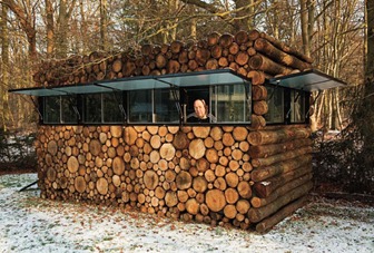
We All Long For One – a private space all to ourselves to work, think, or even just escape to. When popular Dutch musical and comedic performer Hans Liberg (pictured) built himself a small Studio in which he could hone his act without inteeruptions from family, he did so right in his own backyard.
For a getaway to match the showman’s personality, Liberg turned to designer Piet Hein Eek. The cabaret star had previously commissioned Eek, an alumnus of Holland’s famed Design Academy Eindhoven Who now has a international following, to create several of his signature handcrafted, scrapwood furniture pieces for his home.
The result of their latest collaboration, completed last summer, is an iconic log cabin with a twist. Eek switches the orientation of the tree trunks so that the structure more closely resembles a pile of firewood.
The trompe I’oeil is revealed only when the windows – camouflaged with slices of wood – are flipped open. (A second layer of glass beneath slides open). “It’s difficult to feel close to nature in the city.” Eek says. “We created a fairy tale.”
Oak logs line the sides and top of the cabin, while 2 inch thick circular trunk sections are arrayed along the 15 foot long front and back. The surface wood is both glued and mechanically fastened to the plywood substructure.
The cabin was built in Eek’s 40 person production facility. Then transported the 60 miles to Liberg’s residence. The assembly itself is built on wheels to comply with local zoning regulations restricting the number of habitable structures on a single property, making it possible (though highly unlikely) fir Liberg to take it on the road with him.
The fresh, cozy interior of the 100-square-foot box – housing a desk, shelve, and a separate U – shaped seating area – is painted a powder blue to contrast with the exterior’s rustic appearance. Supplied with heat and electricity, Liberg can play his instruments well into the night on even the coldest of days. “I think Hans really loves it. “Eek says. “He’s in there way too much.”
ELEANOR AND WILSON GREATBATCH PAVILION BUFFALO, NEW YORK, USA
It’s fitting that Darwin D. Martin House should be symbolic of the renewal of modern architecture in Buffalo and in particular, the legacy of Frank Lloyd Wright in the city. Martin, secretary for the Larkin Soap Company, was one of Wright’s great patrons. The demolition of Larkin’s headquarters, which Wright designed in 1904, stands as a notorious example of a US city’s indifference to its architectural heritage and the same fate nearly befell the Martin House. After Martin’s death, it suffered neglect and portions were destroyed and replaced by unsightly 1960s condominium blocks.
The University at Buffalo acquired the building in 1967 and the Martin House Restoration Corporation (MHRC) was set up in 1992. After renovation, in 2002 the MHRC invited five emerging firms to compete for the design of a pavilion that would open up Wright’s complex to the public and provide a much needed centre to reintroduce visitors to the city’s modern architecture. The winner was Toshiko Mori, a Japanese-American architect and former chair of architecture at the Harvard University Graduate School of Design, known for her concern with material innovation and conceptual clarity.
As private house became public institution, Mori based her design on inversion. Wright’s overhanging roofs became an upturned canopy, signalling openness, while overlapping enclosures in plan became a visually extensive yet firmly defined rectangle of space. ‘It’s like a chess game,’ says Mori. ‘If Wright moves in brick, I use transparent glass; if he makes a hipped roof, I use an inverted roof.’
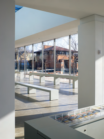
The result seems simple: four central piers, a roof and glass walls. Simplicity, however, requires technical innovation. What appears to be a cantilevered roof is in fact supported by a ring of solid, CNC-milled steel columns at the building’s perimeter, whose slender dimensions (only 70mm square) merge visually with the glass curtain wall to frame a panoramic view of the Martin House.
The pavilion minimises its visual presence and strengthens the experience of the house. ‘It’s an idea of anti-building,’ says Mori, ‘as opposed to the very powerful building of Wright.’ This minimal design achieves a surprising degree of spatial complexity. The asymmetrical position of central piers creates a subtle weighting of distinct zones within the plan and a natural sequence between them. A compact entry space with ticket counter connects to a long, narrow area framed by a glass wall, which looks onto the Martin House. This in turn leads into a broader space containing display cases and interactive screens, both designed by the New York graphic design firm 2x4.
The role of information design in the experience of the pavilion is significant. Mori’s competition entry had a lower level containing auditorium and display areas underneath the lawn between the pavilion and house. The central pier was to house a staircase down to this level, framed by a double-height glass wall and a skylight above. As built, the pavilion is a single floor only. The central glass wall is used to project a film on to the Martin House, into the same space from which visitors look out over the complex.
This double-functioning allowed the square footage of the pavilion to be cut in half. It also strengthens its relationship to Martin House. Rather than simply containing information spaces, the pavilion frames a view enriched by information. The experience marks the culmination of a process more than 40 years in the making that gives new meaning to Wright’s masterwork and extends Buffalo’s tradition of architectural innovation into the present.
Mori’s language of steel and glass is
a consciously lightweight foil to Wright’s more
rooted architecture of brick walls and hipped roofs
The Martin House framed by the pavilion
The inverted roof oversails the
delicate walls of full-height glazing
The concept is Fascinating But The Shows Were A Bit Dull
Canary Islanders are dead sick of tourists. Local government, the PR team, even the biennial director and curator, architect Juan Manuel Palerm Salazar, have said that the Second Biennial of the Canary Islands is about hosting a cultural event for local people. Exhibitions and events are entirely in Spanish, with mostly Spanish, Italian or Portuguese exhibitors, and this year’s theme, ‘Silencio’ (silence), is a call to study the local landscape.
Silencio refers to the exploitation of the Canary Islands’ natural landscape, first as a means of production (mainly bananas), then as a product sold to tourists. The 1970s tourism boom resulted in a raft of badly constructed and ugly hotels littering the coastline, with subsequent developments climbing cliffs and expanding the beaches.
These eyesore developments are such a hot issue that the government currently has a bill in Parliament to freeze all new tourism developments on new land. Old hotels can be refurbished or replaced, but the natural landscape must be preserved – the president of the Canary Islands has said – because the island’s unique The concept is fascinating but the shows were a bit dull tourist economy depends on it.
If the concept is fascinating – the biennial as a multi-disciplinary, intensive study of the islands’ 30-year-old tango with tourism – most of the exhibitions were, frankly, a bit dull. The most interesting work, exhibited in Las Palmas on the island of Gran Canaria, was completed by the biennial’s internal research team, which used detailed maps, documentary photographs and statistics to study the pace and spread of development.
The photography exhibition at CAAM modern art gallery in Las Palmas was another bright spot – a collection of work that documented cities in transition, including Francesco Jodice’s photo series What We Want, which charters how changing cities reveal our desires.
The architectural projects exhibited at CAAM, however, (and this goes for several of the other venues as well) consisted of projects that were several years old, previously published and only tenuously linked to the biennial theme. Most exhibits had their plans crowded, with small type, on to large illuminated boards. Models, drawings or concept sketches were practically non-existent.
In the end, a visit to this fledgling biennial is an excuse, not a reason, to visit the Canary Islands. The ‘keep it local’ biennial concept has potential. If repeated, it could result in some fascinating site-specific work. But, while I did learn a lot about the pressing issues facing the islands – from the boat people that arrive daily from Africa, to internal tensions stemming from tourism and increased multiculturalism – much of this was gleaned from articles in the biennial programme guide. Hopefully the biennial catalogue, to be published later this year, will save punters a disappointing trip by reporting and expanding on the best of the work on show.

The Relationship of Structure to Building
The simplest way of describing the function of an architectural structure is to say that it is the part of a building which resists the loads that are imposed on it. A building may be regarded as simply an envelope which encloses and subdivides space in order to create a protected environment. The surfaces which form the envelope, that is the walls, the floors and the roof of the building, are subjected to various types of loading: external surfaces are exposed to the climatic loads of snow, wind and rain;floors are subjected to the gravitational loads of the occupants and their effects; and most of the surfaces also have to carry their own weight (Fig. 1). All of these loads tend to distort the building envelope and to cause it to collapse; it is to prevent this from happening that a structure is provided. The function of a structure may be summed up, therefore, as being to supply the strength and rigidity which are required to prevent a building from collapsing. More precisely, it is the part of a building which conducts the loads which are imposed on it from the points where they arise to the ground underneath the building, where they can ultimately be resisted.

The location of the structure within a building is not always obvious because the structure can be integrated with the non-structural parts in various ways. Sometimes, a sin the simple example of an igloo (Fig. 2), in which ice blocks form a self-supporting protective dome, the structure and the space enclosing elements are one and the same thing. Sometimes the structural and space-enclosing elements are entirely separate. Avery simple example is the tepee (Fig. 3), in which the protecting envelope is a skin of fabric or hide which has insufficient rigidity to form an enclosure by itself and which is supported on a framework of timber poles.Complete separation of structure and envelope occurs here: the envelope is entirely non-structural and the poles have a purely structural function.


on a structural framework of timber poles.
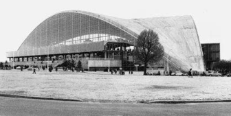
The CNIT exhibition Hall in Paris (Fig. 4) is a sophisticated version of the igloo; the reinforced concrete shell which forms the main element of this enclosure is self-supporting and, therefore, structural. Separation of skin and structure occurs in the transparent walls,however, where the glass envelope is supported on a structure of mullions. The chapel by Le Corbusier at Ronchamp is a similar example. The highly sculptured walls and roof of this building are made from a combination of masonry and reinforced concrete and are self-supporting.They are at the same time the elements which define the enclosure and the structural elements which give it the ability to maintain its form and resist load. The very large ice hockey arena at Yale by Saarinen is yet another similar example. Here the building envelope consists of a network of steel cables which are suspended between three reinforced concrete arches, one in the vertical plane forming the spine of the building and two side arches almost in the horizontal plane. The composition of this building is more complex than in the previous cases because the suspended envelope can be broken down into the cable network, which has a purely structural function, and a non-structural cladding system. It might also be argued that the arches have a purely structural function and do not contribute directly to the enclosure of space.
Fig. 4. Exhibition Hall of the CNIT, Paris, France; Nicolas Esquillan, architect. The principal element is a self supporting reinforced concrete shell
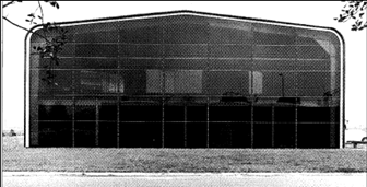
Fig. 5. Modern art glass warehouse, Thamesmead, UK, 1973; Foster Associates, architects; Anthony Hunt Associates,
structural engineers. A non-structural skin of profiled metal sheeting is supported on a steel framework, which has a purely structural function.
The steel-frame warehouse by Foster Associates at Thames mead, UK (Fig. 5), is almost a direct equivalent of the tepee. The elements which form it are either purely structural or entirely non-structural because the corrugated sheet metal skin is entirely supported by the steel frame, which has a purely structural function. A similar breakdown may be seen in later buildings by the same architects, such as the Sainsbury Centre for the Visual Arts at Norwich and the warehouse and showroom for the Renault car company at Swindon.
In most buildings the relationship between the envelope and the structure is more complicated than in the above examples, and frequently this is because the interior of the building is subdivided to a greater extent by internal walls and floors. For instance, in Foster Associates’ building for Willis, Faber and Dumas, Ipswich, UK (Fig 6), the reinforced concrete structure of floor slabs and columns may be thought of as having a dual function. The columns are purely structural, although they do punctuate the interior spaces and are space-dividing elements, to some extent. The floors are both structural and space-dividing elements. Here,however, the situation is complicated by the fact that the structural floor slabs are topped by non-structural floor finishing materials and have ceilings suspended underneath them. The floor finishes and ceilings could be regarded as the true space-defining elements and the slab itself as having a purely structural function.The glass walls of the building are entirely non-structural and have a space-enclosing function only. The more recent Carré d’Art building in Nîmes (Fig. 7), also by Foster Associates, has a similar disposition of parts.As at Willis, Faber and Dumas a multi-storey reinforced concrete structure supports an external non-load bearing skin.


The Antigone building at Montpellier by Ricardo Bofill (Fig. 8) is also supported by a multi-storey reinforced concrete framework.The facade here consists of a mixture of in situ and pre-cast concrete elements, and this, like the glass walls of the Willis, Faber and Dumas building, relies on a structural framework of columns and floor slabs for support. Although this building appears to be much more solid than those with fully glazed external walls it was constructed in a similar way. The Ulm Exhibition and Assembly Building by Richard Meier (Fig. 9) is also supported by a reinforced concrete structure. Here the structural continuity and mouldability which concrete offers were exploited to create a complex juxtaposition of solid and void. The building is of the same basic type as those by Foster and Bofill however; a structural framework of reinforced concrete supports cladding elements which are non-structural.
Fig. 8. Antigone, Montpellier, France, 1983; Ricardo
Bofill, architect. This building is supported by a reinforced
concrete framework. The exterior walls are a combination
of in situ and pre-cast concrete. They carry their own weight
but rely on the interior framework for lateral support.
Fig. 9. Ulm Exhibition and Assembly Building,
Germany, 1986–93: Richard Meier & Partners, architects.
The mouldability of concrete and the structural continuity
which is a feature of this material are exploited here to
produce a complex juxtaposition of solid and void.
(Photo: E. & F. McLachlan)
In the Centre Pompidou in Paris by Piano and Rogers, a multi-storey steel framework is used to support reinforced concrete floors and non-load bearing glass walls. The breakdown of arts is straightforward (Fig. 10): identical plane-frames, consisting of long steel columns which rise through the entire height of the building supporting triangulated girders a teach floor level, are placed parallel to each other to form a rectangular plan. The concrete floors span between the triangulated girders.Additional small cast-steel girders project beyond the line of columns and are used to support stairs, escalators and servicing components positioned along the sides of the building outside the glass wall, which is attached to the frame near the columns. A system of cross-bracing on the sides of the framework prevents it from collapsing through instability.

Rogers, architects; Ove Arup & Partners, structural
engineers. The separation of structural and enclosing
functions into distinct elements is obvious here
The controlled disorder of the rooftop office extension in Vienna by Coop Himmelblau (Fig. 11) is in some respects a complete contrast to the controlled order of the Centre Pompidou. Architecturally it is quite different,expressing chaos rather than order, but structurally it is similar as the light external envelope is supported on a skeletal metal framework.
Fig. 11 Rooftop office in Vienna, Austria, 1988; Coop
Himmelblau, architects. The forms chosen here have no
structural logic and were determined with almost no
consideration for technical requirements. This approach
design is quite feasible in the present day so long as the
building is not too large
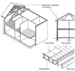
The house with masonry walls and timber floor and roof structures is a traditional form of building in most parts of the world. It is found in many forms, from the historic grand houses of the European landed aristocracy (Fig. 12) to modern homes in the UK (Figs 13 and 14).Even the simplest versions of this form of masonry and timber building (Fig. 13) are fairly complex assemblies of elements. Initial consideration could result in a straight forward breakdown of parts with the masonry walls and timber floors being regarded as having both structural and space-dividing functions and the roof as consisting of a combination of the purely supportive trusses, which are the structural elements, and the purely protective, non-structural skin. Closer examination would reveal that most of the major elements can in fact be subdivided into parts which are either purely structural or entirely non-structural. The floors,for example, normally consist of an inner core of timber joists and floor boarding, which are the structural elements, enclosed by ceiling and floor finishes. The latter are the non-structural elements which are seen to divide the space. A similar breakdown is possible for the walls and in fact very little of what is visible in the traditional house is structural, as most of the structural elements are covered by non-structural finishes.
Fig. 12. Château de Chambord, France, 1519–47. One of the grandest domestic buildings in Europe, the Château de Chambord has a load bearing masonry structure. Most of the walls are structural; the floors are either of timber or vaulted
masonry and the roof structure is of timber
Fig. 13. Traditional construction in the
UK, in its twentieth-century form, with
load bearing masonry walls and timber
floor and roof structures. All structural
elements are enclosed in non-structural
finishing materials
To sum up, these few examples of very different building types demonstrate that all buildings contain a structure, the function of which is to support the building envelope by conducting the forces which are applied to it from the points where they arise in the building to the ground below it where they are ultimately resisted. Sometimes the structure is indistinguishable from the enclosing and space-dividing building envelope, sometimes it is entirely separate from it; most often there is a mixture of elements with structural, non-structural and combined functions. In all cases the form of the structure is very closely related to that of the building taken as a whole and the elegance with which the structure fulfils its function is something which affects the quality of the architecture.
Fig. 14. Local authority housing, Haddington, Scotland,
1974; J. A. W. Grant, architects. These buildings have
load bearing masonry walls and timber floor and roof
structures
Working with Aluminum Part 2
Before these limitations are reached, however, cost and availability may be overriding considerations. A number of techniques can be employed to minimize extrusion cost:
1) Minimize the size of the smallest circle that encloses the section. Sometimes this can be done by extruding a folded version of the section desired and then unfolding it after extruding by rolling or bending.
2) Avoid hollows where possible. They require more complex dies and are more difficult to extrude.
3) Avoid large differences in wall thickness in different parts of the cross section. For 6063, the largest ratio of maximum to minimum wall thickness should be 3:1; for 6061-T6, use 2:1.
4) Keep the perimeter-to-cross-sectional area ratio as low as possible. Some extruders estimate costs based on this ratio.
5) Avoid sharp corners, using generous fillets or rounding where possible.
6) Ask extruders which changes to a proposed section would reduce cost.
Extruded structural shapes can perform additional functions by incorporating some of these features :
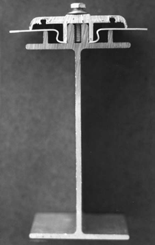
1) Interlocking Sections: Extrusions can be designed to interlock with other extrusions to facilitate connections. Several kinds of extrusion interlocks exist. Some are designed to act like hinges (Figure 5a), with one piece being slid into the other from one end. Other extrusions are designed with nested interlocks that align parts, which are then fastened together (Figure 5b). Still others are designed as friction fit or snap-lock interlocks, which require the parts to deform elastically to fit together (Figure 5c). Unlike the first two joints, the friction fit joint cannot be disassembled without destroying the parts. None of these interlocks are considered to transmit enough longitudinal shear to enable the parts to act as a unit structurally without other means of fastening (133). To prevent longitudinal slippage at significant loads requires a fit too tight to make with parts extruded to standard tolerances.

2) Skid-Resistant Surfaces: Although the extrusion process is only capable of producing longitudinal features in a cross section, skid-resistant surfaces are routinely made with extrusions. This is achieved by extruding small triangular ribs on the surface (Figure 6), and then notching the ribs in the transverse direction after extruding. Extruders may perform the notching economically by running a ribbed roller over the ridges.
3) Indexing Marks: Shallow grooves extruded in parts can indicate where a line of holes is to be punched or drilled. These marks (raised or grooved) can also be used to identify the extruder, distinguish an inside from an outside surface, or distinguish parts otherwise similar in appearance. Dimensions for a typical indexing mark are shown in Figure 7.
4) Screw Chases: A ribbed slot (also called a screw chase or boss) can be extruded to receive a screw. This may be used, for example, to attach a batten bar to a frame member (Figure 8). A method for calculating the amount of lateral frictional resistance to sliding of a screw in a chase is given in AAMA TIR-A9-1991 (34). This calculation must be performed if the design considers both of the connected parts to act as a continuous section. The dimensions of the screw chase are a function of screw dimensions and strength. If the screw chase is too narrow, the head of the screw may break off before the
screw is fully driven. If the chase is too wide, the ribs of the chase may strip during fastener installation. The maximum screw torque before stripping is fairly sensitive to the chase width. The narrow dimension of the chase should be less than the root diameter of the screw. The dimensions used successfully for a screw chase for a -20 UNC screw are shown in Figure 9.

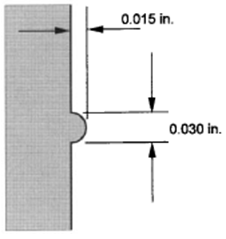
Figure 8. Use of a screw chase to connect extruded parts. (Courtesy of Conservatek
Industries, Inc.)
5) Gasket Retaining Grooves or Guides: In curtain wall, fenestration, and other applications, elastomeric gaskets are often required between parts. By extruding a groove in the metal that matches a protrusion on a gasket, you can eliminate the need for field assembly or adhesives. Usually the gasket is press-fit into the extrusion in the shop. Dimensions for such a detail are shown in Figure 10. Care must be taken to avoid stretching the gasket during installation to prevent contraction of the gasket in the field to a length shorter than required.
6) Extrusions as a Substitute for Plate: Plate costs about 1 times the cost 1–2 of extrusions, so it’s desirable to utilize extrusions rather than plate wherever possible. Extruding to final width dimensions also eliminates the need to cut plate to the desired width, thereby saving fabrication costs. Extruded bars are available from a number of extruders through about 18 in. [457 mm] widths or more, depending on thickness.
7) Non-prismatic Extrusions: Extrusions may have different cross sections along their length when stepped extrusion methods are used. The smallest section is extruded first, the die is changed, and a larger section that contains the full area of the smaller section is extruded next. This method is used on aircraft wings to minimize the amount of machining needed to produce tapered members. Other tapered members, such as light poles, may be produced by spinning. Set-up costs for these methods are high, so they tend to be used only on parts that will be produced in quantity.

Figure 10. Dimensions to allow a gasket to be press fit into an extruded slot
8) Grooves for Fasteners: Grooves can be extruded to permit screw heads to be flush with the surface of an extrusion to avoid the need for countersinking the fastener hole. Groove widths sized to a bolt head flat width can also be used to prevent rotation of the bolt during tightening of the nut. Another use for grooves is to reduce the loss of cross-sectional area that occurs at holes (Figure 11).
9) Integral Backing for Welds: As shown in Figure 12, built-in backing for longitudinal welds along an extrusion edge can be provided, eliminating the need for separate backing and the need to hold it in place during welding.
Hollow Extruded Shapes If you’re like most people, you may need a moment of head scratching to imagine how hollow extruded shapes are possible. Extruders use three methods :
Figure 11. Use of an extruded groove in a line of bolts to secure the bolt heads
from spinning, and to reduce the loss of effective net area in the cross section
Figure 12 Extruded integral backing for a weld. (Courtesy of the Aluminum
Association)
1) Solid Billet and a Porthole Die: In this method, the metal is divided into two or more streams by the supports for the mandrel that forms the hollow portion of the shape. The metal must reunite (sometimes referred to as ‘‘welding’’) behind the supports before it flows through the die, outlining the perimeter of the shape.
2) Solid Billet and a Piercer Operating Through a Hollow Ram: This method avoids the seams inherent in the porthole die approach and, thus, produces a seamless extrusion.
3) Hollow Billet with a Die and Mandrel: This method also produces a seamless extrusion, but it is rarely used.
The material specification identifies if hollow extrusions must be seamless (for example, ASTM B241 Aluminum and Aluminum-Alloy Seamless Pipe and Seamless Extruded Tube) (53). Do seamless hollow shapes have better structural properties than shapes with seams? The answer is no, not with respect to material properties; the minimum strengths for porthole die produced hollow extrusions are the same (all other things being equal) as those for seamless extrusions. For properly extruded shapes, seams do not appear to have any adverse effect on structural performance, such as burst pressure or fatigue.
Working with Aluminum (Part 1)
Now that you’ve heard about aluminum, you may want to know what it looks like. We’ll describe it, beginning with the forms in which it is produced, how these forms are shaped and altered to become structural components, and how these components can be dressed up with coatings. We will include some comments on how this process differs from the preparation of steel for duty and will conclude with a few suggestions on how to put the structural components in to place. This chapter, then, presents the product forms in which aluminum is most commonly used for structural components, and how these product forms are fabricated and erected.
1. PRODUCT FORMS
The forms of aluminum used in structural components include extrusions, flat-rolled products, castings, and forgings. The most widely used of these forms are extrusions and the flat-rolled products, sheet and plate. Castings typically have less reliable properties than the wrought product forms, and forgings are often more expensive to produce than other wrought forms. Castings and forgings do, however, lend themselves to more complex shapes than extrusions and flat-rolled products.
1.1 Extrusions
Introduction What do aluminum and Play-Doh have in common? They can both be extruded, of course (Figure 1). Extrusions are produced by pushing solid material through an opening called a die to form parts with complex cross sections. Aluminum is not the only metal fabricated this way, but it is the most readily and commonly extruded. (Stainless steel can also be extruded, but it requires such great pressures that only small and simple stainless shapes can be made). The extrusion process makes aluminum an extremely versatile material for structural design. Rather than being limited to the standard rolled shapes, designers can concoct their own cross sections, putting material where it is needed. Solid and hollow cross sections, even sections with multiple hollows, can be readily extruded (Figure 2).
Figure 1. Engineer of the future extruding a Play-Doh I-beam. (Play-Doh is a
registered trademark of Kenner.)
Figure 2. Examples of complex extruded shapes. (Courtesy of Cardinal Aluminum
Co.)
While extrusions dominate applications for parts with a constant cross section, bar and rod are also produced by rolling, and tubes and wire by drawing, a process by which material is pulled (as opposed to pushed) through a die to change the cross section or harden the material. Cold-finishing may be used to improve surface finish and dimensional tolerances. Sometimes a combination of methods is used; for example, tube may be extruded and then drawn; bar may be rolled and then cold-finished. Products that have been cold-finished or drawn are held to tighter tolerances on cross-sectional dimensions than extruded products.
Standard Extruded Shapes Before World War II, most aluminum shapes were produced by rolling, like steel, and so had cross sections similar to those of steel. Many of these shapes had sloped flanges that facilitated rolling but complicated connection details. Wartime and postwar demand for aluminum products prompted better production techniques, especially extrusions, which eventually displaced much of the rolled production. Since extrusions are not subject to the limitations of the rolling process, the need for sloped flanges was gone. Extrusions continued to be produced in shapes that looked like rolled products, however, because these shapes were standard. Around 1970
the Aluminum Association introduced standard channel and I-beam shapes designed to be extruded, with constant thickness flanges and optimum dimensions for strength (Figure 3). Today, almost no aluminum shapes are produced by rolling. Many of the old cross sections suited to production by rolling are still shown in catalogs, however, even though today they are extruded, not rolled.
Figure 3. Rolled shape with sloped flanges, and extruded shape with constant thickness
flanges.
A number of common extruded shapes are shown in extruders’ catalogs. Some of these shapes, as well as the Aluminum Association standard shapes, are included among those listed in the Aluminum Design Manual, Part VI, Section Properties. Extruders usually maintain an inventory of dies. Some are proprietary and, thus, are for the exclusive use of a particular customer; others are called open dies, and these are the shapes shown in catalogs and available to any paying customer.
The Aluminum Association has established standard extruded I-beam and channel shapes, as mentioned above, in depths from 2 to 12 in. (They are not available in hard metric sizes.) These sections are efficient for structural applications and are produced by a number of extruders. Appendix B contains dimensions and section properties for these shapes, called Aluminum Association standard channels and I beams. Design data for these shapes is given in Appendices D and E.
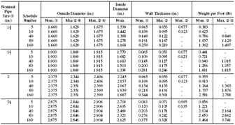
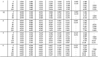
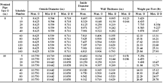
Aluminum pipe, with the same dimensions as steel pipe of the same nominal size and schedule, is also extruded, in diameters up to 12 in. Dimensions and section properties are listed in Table 1. Aluminum pipe is usually 6061-T6 alloy, but it is also produced in 3003-H18 (but only under 1 in. nominal pipe size), 3003-H112, and 6063-T6.
Custom Extruded Shapes Sometimes the Aluminum Association or other standard shapes are impractical or inefficient for a specific application. In these cases, users may design their own shapes. Keep in mind that some limitations exist :
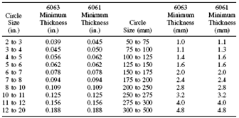
1) Minimum Thickness: The minimum thickness is a function of a number of factors, including the circle size (larger shapes require larger wall thickness) and whether a shape is hollow or solid. Table 2. provides approximate guidelines, but actual limits depend on the shape and the extruder. Elongation testing is not performed for shapes less than 0.062 in. [1.6 mm] thick.
2) Maximum Length: Extrusions can be produced up to 100 ft [30 m] long, but 40 ft [12 m] is generally the practical limit for extrusions shipped by truck. Structural shapes available from metal supply warehouses usually are stocked in 20 ft or 25 ft [6 m or 7.5 m] maximum lengths.
3) Maximum Circle Size: Extrusions are produced from billets, which are usually cylindrically shaped. Because of this, extrusion cross-section size is usually limited to that which fits within a circle. Larger extrusion presses use larger circle size dies. There are numerous 10 in. [250 mm] and smaller presses, about a dozen mills with presses larger than 12 in. [300 mm], while the largest in North America is 31 in. [790 mm]. Because of production limitations, an extrusion typically cannot fill the full area of the circle, but rather only part of the circle area (Figure 4).
4) Maximum Area: The largest cross-sectional area that can be extruded is about 125 in2 [80,600 mm2].
5) Maximum Weight: The maximum total weight of an extrusion is limited by the weight of a billet to about 4,300 lb [2,000 kg].

TABLE 1. Diameters,Wall Thicknesses,Weights—Pipe(continued)
TABLE 1. Diameters, Wall Thicknesses, Weights—Pipe (continued)
➀ In accordance with ANSI/ASME Standards B36.10M and B36.19M.
➁ Based on standard tolerances for pipe .
➂ Based on nominal dimensions, plain ends, and a density of 0.098 lb per cu in., the density of 6061 alloy. For alloy 6063, multiply by 0.99, and for alloy 3003 multiply by 1.011.
④ For schedules 5 and 10, these values apply to mean outside diameters.$
TABLE 2a. Approximate Minimum Thicknesses for 6061 and 6063
Solid Extrusions
TABLE 2b. Approximate Minimum Thicknesses for 6061 and 6063
Hollow Extrusions
Figure 4. Useable portion of an extrusion circle size. Extrusion profiles must generally
fit within the area indicated by the dotted line


