Worth The Weight
|
|
Contractors Need to See A Clear Hierarchv In The Lines of Your Drawings
DO you EVER WONDER why contractors look at you as if you don't know a thing about construction? Have you ever wondered what they're thinking as they pore over your contract documents and seem to grab numbers our of thin air for the bid?
As someone whose job it is to bring brilliant ideas to life, l can tell you: You're not alone. I gun a landscape architect who works as a construction manager. I've worked with some really exciting designs by outstanding firms and fostered them through their construction. Sane designers have been more theoretical than others, and some have shown a cohesive understanding of taking a design into construction-although that characteristic, in my experience, is rare. Landscape architects often lack chat under standing because they're simply not in volved in construction for various reasons. People in young firms, in particular, don't always have the exposure to construction they need. This is where my niche in the profession firs in-helping those without the knowledge base realize their designs and ensuring the clients are receiving what they thought they bought . As welI as translating it al I to the connectors, who are the key recipients of design knowledge.
Much of the transfer of this knowledge to contractors takes place in constructability reviews for clients. In those reviews, one of the most common problems I run across involves errors on drawings. And by far, the most common drawing errors involve the hierarchy of line weights. This may sound basic, but it's amazing how many firms do not understand the importance of ensuring that line weights are right.
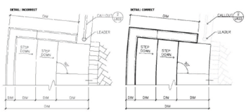
Using a single line weight (above left) leaves design intent vague to a contractor.
The example on the right shows a clear hierarchy among drawing elements
If you have a readable set of drawings, yowl l get the respect of the contractor and a well-built project. If you can't tell the difference between various elements on the drawing when it's printed, you're not communicating your design Intent the contractor, who is the ultimate decider in making your vision a success.
For the past 15 years, while doing constructability reviews, I’ve seen the observance of industry conventions for drafting, dimension lines, and line weight become consistently worse in construction drawings. AutoCAD is not the answer to the realization of your design; readability of the printed drawing set is. Members Of your design staff need to understand they can override AutoCAD to correct deficiencies - AutoCAD is a vehicle, not the driver. If the contractor can't look from one detail to another or from one page to another and see the same convention, then the drawings are a mess. Unfortunately, these problems are more common than you think.
It's important to Study and use the industry line weight standards for all drawing types. Although these standards were developed when landscape architect drew everything by hand, they need to translate to the computer. We also have to consider that contractors basically use half-size drawings to build from, so make sure your line weight hierarchy reads at both full size and half size.
Here are some common errors I consistently see on the main drawing types in a construction set of drawings.
In Plan
A line-weight hierarchy is needed between hardscape and softscape. Let's look specifically at grading plans. Too often, I see the contours in a grading plan drawn at the same line weight as the hardscape. Think about what you're trying to communicate in that drawing--the topography in a grading plan-and let the Contours show themselves -as the predominant element. With that basic understanding, make sure your five-foot contours and l0-foot contours are slightly heavier than the other contours to help in overall legibility of the topography. They can be the same line weight but different from all others. And remember, line weights that look great on the screen may be unreadable when printed.
In Elevation
In an elevation you're trying to communicate a series of elements to help explain your vision. Within this series is the main element, and chat needs to hold the strong line weight. Along with a hierarchy of line weights within an elevation, I often see no 1, anchoring" to the elevation. What holds the drawing down-where does the element you •re trying to emphasize begin on the ground plane?
In Detail
Say you're trying to detail a stair. Sounds simple, but if you don't use hierarchy, it will be hard to read- So make sure to distinguish between the elements. Make sure your ground plane (in this case, the treads and risers) reads clearly. Express the relationship among the stair, railing, and other surrounding elements so your stair is the most prominent figure. }lave the railing read as the second most prominent figure, since It's the supporting element to the stair, and have everything else fade back. The dimension lines are also Important. Let them read; don't make them coo light. In addition to problems with line weight, I am forever seeing the dimension numbers all over the place. By industry standard (not AutoCAD) the number should be placed consistently on top of the leader line or centered on the leader line-never underneath in some places just because it's easier Override AutoCAD's defaults. It can be done.
In Layout
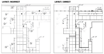
The layout is one of the most important yet least thought-out drawings. This is where you want the elements of your design to be placed and placed correctly. When you're using a coordinate system to lay out the elements on a larger site, it's a bit easier, but make sure the contractors in your area know how to lay out by coordinates. Nor all of them do. And when using dimension lines, the consistency mentioned above for the details is still imperative.
Communication is the key. Contractors can be your friend-and you want it chat way, if possible, because ultimately, they control the success of your work. Paying attention to the technical part of your design and graphic communication will always get you a better than result.


Currently have 0 comments: