In with the old
|
|
AFTER 20 YEARS, LONDON’S MARCHANT ANTIQUES STORE WAS CRYING OUT FOR A REFRESH
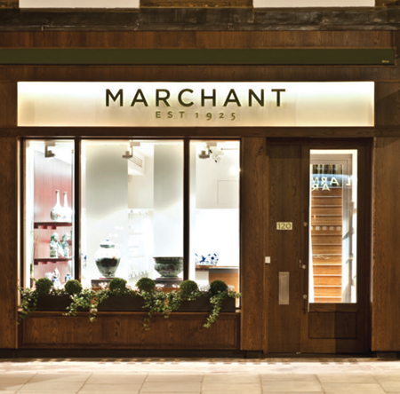
Modernising a space that exists solely to promote ‘the old’ was far less complicated than it sounds, according to Steven Southall, associate at SHH, the UK-based architecture, interiors and branding consultancy. Southall was the project architect responsible for a complete overhaul of the Marchant antiques store on London’s Kensington Church Street. This included a new brand identity, store fascia, extension and interior concept for the 85-year old family business.
Established in 1925, the S Marchant & Son dealership is a specialist in Chinese ceramics and artworks. It has been managed by three successive generations of the same family, with father and son team Richard and Stuart Marchant currently at the helm.
The rebranding exercise started with a change in name. From the previous ‘S Marchant & Son’ brand, SHH developed the more concise ‘Marchant’ identity. A new visual identity was inspired by the importance of jade in Chinese artworks and plays with the two shades of clas-sic green and ‘white’ jade, which is in fact a lighter shade of green. A pattern was developed around the logo, tying in with an Asian motif that is used for interior fretwork walls surrounding the store’s staircase.
Previous to this latest upgrade, the store hadn’t been refurbished in over 20 years – and was beginning to show its age. In need of an injection of contemporary style, the store required a fresh new look that would strengthen the brand and enhance the overall Marchant experience.
The brief called for a rationalisation of the building’s space plan, in order to increase and enhance the display/gallery area. The design team was instructed to pay particular attention to functionality, as the existing store had in fact functioned extremely well.
“We were asked to create a scheme that was contemporary but with a classic and timeless air, so that it could easily last another 20 years without looking dated,” noted Neil Hogan.
1. The antiques store hadn’t been changed in 20 years.
2. A fl oor plan of the Marchant store.
3. A library is located on the lower ground floor.
4. Office areas were also given a revamp.
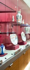
5. The display area is the heart of the store.
creative director, SHH. “It was also important to maximise gallery space and indeed, thanks to our new space plan, we have increased gallery space overall by 20%.”
The display area is the heart of the store and, as such, was a critical component
of the new design. Dedicated gallery space is found on the ground floor of the four-storey building, which is entered via a lobby space that leads in from the main entrance.
In this main space, the entire left wall houses a new, bespoke display system, made of non-refl ective glass and bamboo. Storage is incorporated into the bottom of the system, while top and low-level front lighting, custom designed by SHH, enhances the overall ambience. Artefacts are set against a deep red wall, a dramatic backdrop that draws immediate attention to the items on display.
It was essential that the design of the display area was not overwhelming and didn’t detract in any way from the protagonists of the show – the antiques themselves. “A successful modern or contemporary scheme is the result of clean detailing and the utilisation of simple, clean forms and materials,” Southall explained.
“The clarity of display that is derived from the detail of the artwork contrasting against the simplicity of the display cabinets was the brief from day one when creating the concept; a
process which is adopted in auction houses and museums throughout the world,” he continued.
“We worked very closely with our joinery manufacturers in conjunction with the non-refl ective glass and Corian suppliers, obtaining multiple samples and fabricating off-site mock-ups. This facilitated the creation of the most important aspect of the gallery – the
display – in order to meet the practical and design requirements successfully,” Southall said.
Another defi ning feature of the new Marchant interior is a striking stair spine that links the store’s four fl oors. White, full-height fret-cut panels, in a pattern that echoes traditional Asianmotifs, envelop the stairs.
6. Fret-cut panels are Asian-inspired.
7. Stairs to The Second Floor.


Currently have 0 comments: